mPulse 101
A Real User Monitoring (RUM) tool is something that should be in the bag of everyone that’s serious about web performance. In this article I’ll give you an introductory tour of mPulse – Akamai’s RUM solution.
Synthetic monitoring tools, like WPT and Pingdom, measure performance of a single page of your site from a controlled lab setting. mPulse, on the other hand, captures 100% of your real user traffic and provides meaningful insights into real-world end user performance. We recommend using both synthetic and RUM measurements for a complete understanding of performance. See my article comparing synthetic to RUM tools for more information on the differences between the two.
Unique Capabilities
There are several important capabilities of mPulse that make it unique as a RUM tool.
mPulse:
- Collects performance data from every site user and gives you a full real-time view of performance
- Visualizes performance data through easy-to-use, customizable dashboards
- Stores performance data at full fidelity for 13 months, allowing you to do year over year analysis
- Correlates performance data to business metrics, allowing you to understand how performance impacts the bottom line
- Helps to identify the root cause of performance issues, allowing you to quickly isolate and resolve issues
- Proactively alerts on performance violations based on machine learning anomaly detection
Implementation
Let’s take a closer look at mPulse, starting with how it works. mPulse captures performance data from end-users through a javascript snippet that runs in the user’s browser. This snippet is based on the Boomerang performance collection project and executes in a non-blocking, asynchronous iframe so as not to impact the performance of your application. You can either inject the snippet yourself using a tag manager or, if you’re an Akamai customer, we can inject the snippet for you through a behavior in the property manager configuration. Performance data is collected for every page the user visits and beaconed back to the mPulse infrastructure for real-time visualization on dashboards. Both traditional web apps and single-page applications are supported.
Dashboard Types
mPulse is used through several parts of the organization and provides a single pane of glass through which to view performance data. As we see in the Library view, dashboards can be organized into folders based on functional teams.
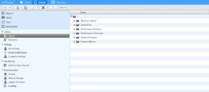
Dashboards in the Performance Overview folder provide high level performance information. Dashboards include those for Core Web Vitals monitoring and for comparing performance between releases.
Dashboards exist for operational monitoring, including dashboards for BOT analysis, application errors, and CDN metrics (for Akamai customers).
The Business Impact folder contains dashboards to show the relationship between performance and business metrics, including a dashboard for predictive analytics and for conversion impact.
Dashboards in the Performance Analysis folder provide deep insight into the root cause of performance issues, allowing developers and architects to quickly identify hot spots within the application. Let’s take a look at some of the dashboards in each folder.
Performance Overview Dashboards
The Overview dashboard provides high level performance data that we can drill into for more detail.
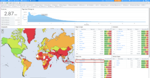
Here I can see that 98% of my traffic is coming from the US. Let’s filter to just US traffic by selecting United States from the Countries filter.
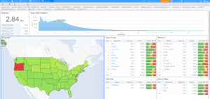
Each state looks good (as you can see from the green color) except for Oregon. Let’s drill into Oregon to see what’s going on.
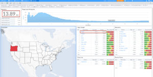
The median load time is 13.89 sec from Oregon and that the poor performance is on the Product page, which makes up 58% of the traffic. Let’s filter to the product page.
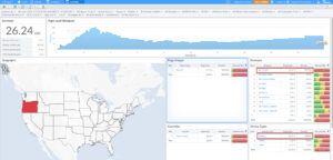
A few things pop out. First, 89% of the traffic is from Desktop, where before most of our site traffic was mobile. Also, the poor performance is coming from Chrome. Let’s expand Chrome to look at the versions of Chrome that are accessing our site.
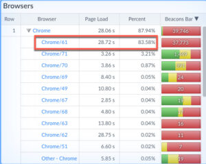
And we see that the poor performance is coming from an older version of Chrome, 61. This leads me to believe that this is bot traffic hitting our product page. There are options in mPulse not to include bot traffic if you want to exclude this type of data from your reporting. But hopefully you see how easy it is to drill into specific segments of your user population using the dashboard filters.
Let’s take a look at the Core Web Vitals dashboard. Google recently introduced new signals that impact SEO rankings so it’s important that we understand and are able to measure these new metrics. This dashboard allows us to do just that for our real users.
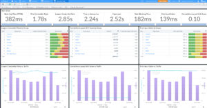
Widgets are available for each of the 3 metrics – Largest Contentful Paint (LCP), Cumulative Layout Shift (CLS), and First Input Delay (FID). The middle group of widgets show the pages that are impacted. The bottom widgets show trending over time.
Another important dashboard is the Comparison Dashboard.
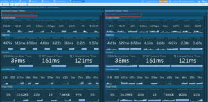
In this example we’re comparing 2 time periods, May 7 to May 8. This could represent the time between application releases or other platform changes. And we’re comparing several types of performance data, including business metrics, network timings, CWV, Image performance, etc. We can see that we had over twice as many page views and completed sessions and also over double the number of orders and revenue. Like all other dashboards, this dashboard can be customized to show the data that you want to compare.
Business Impact Dashboards
Let’s take a look at some of the business impact dashboards. These dashboards are often used by marketing or business analytics teams to understand the relationship between performance and business goals.
The Metrics dashboard is used to show the correlation between performance and metrics that matter to the business. mPulse collects certain session metrics out of the box, like page view, completed sessions, bounce rate and session length and duration. But it also allows you to create custom business metrics. So if you’re a retailer things like conversion rate and revenue are important to you. If you’re a financial institution, things like account openings, credit card applications, or funds transfer matter to you. If you’re a media company, metrics like ad revenue or percent of videos played are key for you to track. A custom metric can be set up to capture whatever the activity you’re driving your customers to perform. That metric can then be correlated to performance.
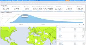
In this example we see that the average conversion rate over this 7 day period is 2.66%. But let’s look at the correlation graph below. The green line represents the conversion rate and the x axis is the page load time. The blue area represents the number of completed sessions at a given page load time. Hovering over the intersection of the green and blue lines, we see that when the page loads in 2.25s, the conversion rate improves significantly to 4.26%. And the conversion rate drops significantly after 2.5 seconds. This graph tells us that users will convert more when their page load times are 2.25 seconds or better vs the current 2.85 second median. So if we want to maximize conversion on the current site, our goal should be a 2.25 second or better load time for as many users as possible.
Now that we know that there is a direct relationship between performance and our business goal, let’s look at how to quantify that. The What-If dashboard is a predictive analytics tool that uses data modeling to predict the impact of better performance on other metrics.
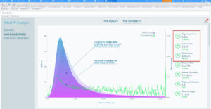
This example predicts that a 1sec reduction in page load time would result in an increase in conversion rate of .53% to 3.16% and an increase in order value of $4.8M to $28.4M over the 7 day period that we’ve selected. Moving down the dashboard we can perform our own what-if predictions by moving the page load slider.
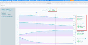
What if I’m able to get my load time down to 2 seconds? We can see the impact on our important metrics. And likewise, if something happened to degrade performance by 500 ms, we can see the negative impact on our key metrics. The What-if dashboard is a great tool for helping to quantify the impact of performance on the business and helping to justify the investment in performance tools and best practices.
Now that we know that performance matters to the business, and we can actually quantify that impact, it’s time to start tuning the site so that we can realize predicated gains. But where do we start in the tuning process? Should we start with the worst performing page or is there a better way to understand tuning priorities? This is where the Conversion Impact Dashboard comes in. This dashboard tells us the pages whose performance has the most impact on our business goals. It’s basically examining the pages in the session flow and prioritizing the pages that, if made faster, will have the biggest impact on our goal.
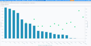
The blue bar represents the correlation score page and the green dot is current page load time. Of the 3 pages with the highest correlation score, the Category page has the highest load time. So there’s probably some low hanging fruit that we can find and fix on that page.
Performance Analysis Dashboards
This takes us to the Performance Analysis dashboards, which are used by developers and architects to quickly identify the root cause of performance issues. We’ll look at 2 of those dashboards here. The first is the Resource Treemap dashboard.
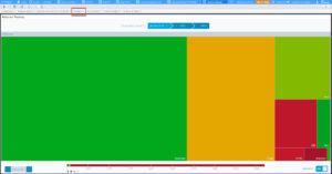
As you can see we’ve filtered to just the Category page. This dashboard visualizes the various types of resources that make up the page and give them a color grade based on their performance. The size of each resource box indicates the amount of that resource type. So the largest resource type is javascript, followed by images. Clicking into the JavaScript box shows the domains that are serving JavaScript to the Category page.
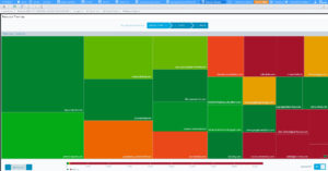
Again, the colors indicate performance. Click on a domain shows all the JavaScript resources from that domain and their performance.
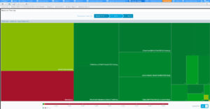
This is a quick way to visually understand page resource performance.
A final dashboard is the Aggregate Resource Waterfall, which shows resource performance in the context of the page load process.
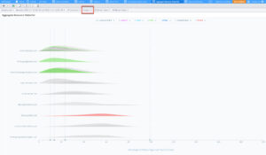
Again, we are filtered to the Category page. Each domain that serves content to the page is listed on the left row. For each domain, content types are color coded. Grey is JavaScript, Purple are images, green is Css, blue is HTML. Also important are the vertical lines, which represent phases of the page load process. The first line is TTFB followed by DOM Content Loaded, Start Render, and finally DOM READY. Our goal is to try to understand the resources responsible for the gaps between the lines. We see that the largest gap is between start render and DOM Ready. As we scroll down the list, we see lots of JavaScript resources.
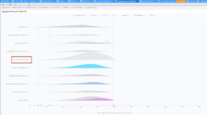
But there is a huge JavaScript from coremetrics.com that takes 708ms to download. There are also several images that could likely be deferred to speed up the time that the page is usable.
Alerting
mPulse is also a great tool for being made aware of performance violations through alerts. Two types of alerts are supported. Static alerts allow you to set a fixed performance threshold for any timer or metric collected. So, for example, if LCP exceeds 2 seconds, send me an alert.
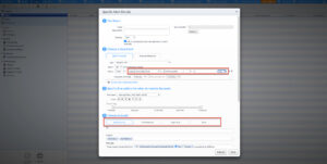
Alerts can be sent in the form of an email, a webhook if you want to integrate with a helpdesk or ticketing application, and we also integrate with pager duty, and slack.
The second type of alert is anomaly detection, where mPulse employs a statistical model that represents a normal behavior range based on historical data and triggers an alert when conditions fall outside of that range.
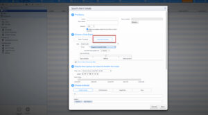
Again, anomaly alerts can be set on any timer or metric collected by mPulse.
Reports
Now that you’re able to capture all of this rich performance data, you’ll want to share it with others in your organization, either on a scheduled basis or as a one-off event. You can do this with mPulse Reports. Reports contain one or more dashboards and are delivered as either a URL to the dashboard or as an image.
Conclusion
mPulse is an industry leading RUM solution that helps you understand:
- The state of your current performance
- How fast you need to be to meet business objections
- The changes you need to make to get faster
It’s a great addition to any web performance toolkit.